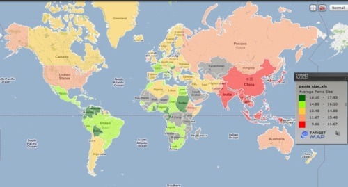
All hail the internet, and more importantly, all hail the individuals who dedicated the time and resources needed to create a map of the world that charts average male penis size by country. Yes!
The map uses a color-coding system to differentiate countries based on the length of their males’ erect penises. As you’ll observe, there are some surprises revealed by this helpful map. Not all stereotypes are true… Many of them are…
And don’t worry, the map includes both US and Metric system measurements, so you’ll be able to accurately consider every man you’ve hooked up with regardless of what side of the pond you’re on. I mean, if you want to.
Personally, I was a little disappointed by the America’s performance. Though nothing new there, right?
Now, my first question was, where did they get these numbers from? I did my due diligence and discovered that there are references provided for each country listed via a corresponding article. The data sources (included below) are usually the Ministry of Health or a department of anthropological statistics. I am still mildly dubious about the statistics, but whatever.
This chart is fascinating and funny and someone took the time to create it!!
Have at it, lovelies. Xo SFAR
To view the map courtesy of Target Map: click Here
To view sources references: click Here